Why Mobile-First Approach is Essential in eCommerce
14 Mar 2024 • 13 min read

Marcin Kulawik

The eCommerce landscape is witnessing a significant shift towards mobile shopping, a trend that's reshaping the way businesses approach online sales. This transformation is driven by the rise of mobile eCommerce, or m-commerce, which has seen a dramatic increase in recent years. At the heart of this evolution is the concept of mobile-first development – an approach that prioritizes designing and developing for mobile devices before larger screens. This strategy acknowledges changing consumer behaviors and preferences, where a growing number of customers are choosing their mobile devices for shopping activities. With statistics indicating a steady growth in m-commerce, understanding and adapting to this mobile-first world has become essential for businesses looking to thrive in the digital marketplace.
What is Mobile-First Development?
In today’s digital era, smartphones have become an integral part of our lives. This trend has given rise to the mobile-first development approach in eCommerce. Unlike traditional methods, this strategy begins with designing and developing for mobile devices.
Contrast with Traditional Development
Traditional development strategies usually revolve around creating a desktop version first, then adapting it for mobile. Mobile-first development flips this approach, focusing on the mobile experience from the start.
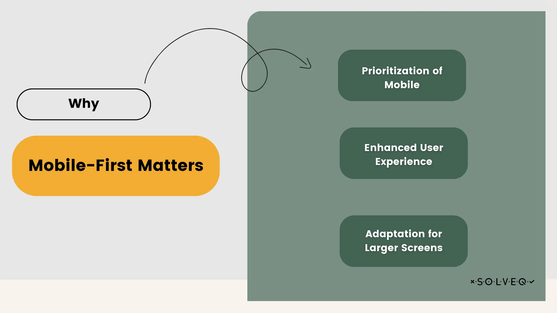
Why Mobile-First Matters
- Prioritization of Mobile: This approach ensures that the primary experience is optimized for mobile users, which is crucial as more people use their smartphones for internet access and online shopping.
- Enhanced User Experience: Mobile-first design focuses on creating a seamless and user-friendly experience, which is vital for engaging today's on-the-go consumers.
- Adaptation for Larger Screens: Once the mobile version is perfected, the design is then scaled up for larger screens, ensuring consistency and functionality across all devices.
By employing a mobile-first strategy, businesses align themselves more effectively with the current and evolving patterns of consumer behavior. This not only improves user engagement but also anticipates future trends in mobile usage.
Why Mobile-First is Essential for eCommerce
The indispensability of a mobile-first approach in eCommerce stems from several crucial factors that collectively enhance the overall effectiveness and reach of an online business.
- User Experience (UX): The heart of mobile-first design lies in crafting an intuitive and convenient user experience, tailored for smaller screens. This is not just about aesthetic appeal; it directly influences conversion rates and customer retention. A mobile-optimized interface ensures that customers can navigate, explore, and make purchases with ease, reducing frustration and abandoned carts.
- Search Engine Optimization (SEO): Google's shift towards mobile-first indexing underscores the importance of mobile-friendly websites in search rankings. This means websites optimized for mobile have a better chance of ranking higher in search results, driving more organic traffic to the site. For eCommerce sites, this can translate into increased visibility and sales.
- Global Reach: Adopting a mobile-first strategy is particularly vital for tapping into mobile-dominant markets. In many regions around the world, especially in developing countries, a majority of internet users access the web exclusively via mobile devices. A mobile-first approach thus opens doors to a much wider audience, extending a brand's reach globally.
Key Components of Mobile-First E-commerce Sites:
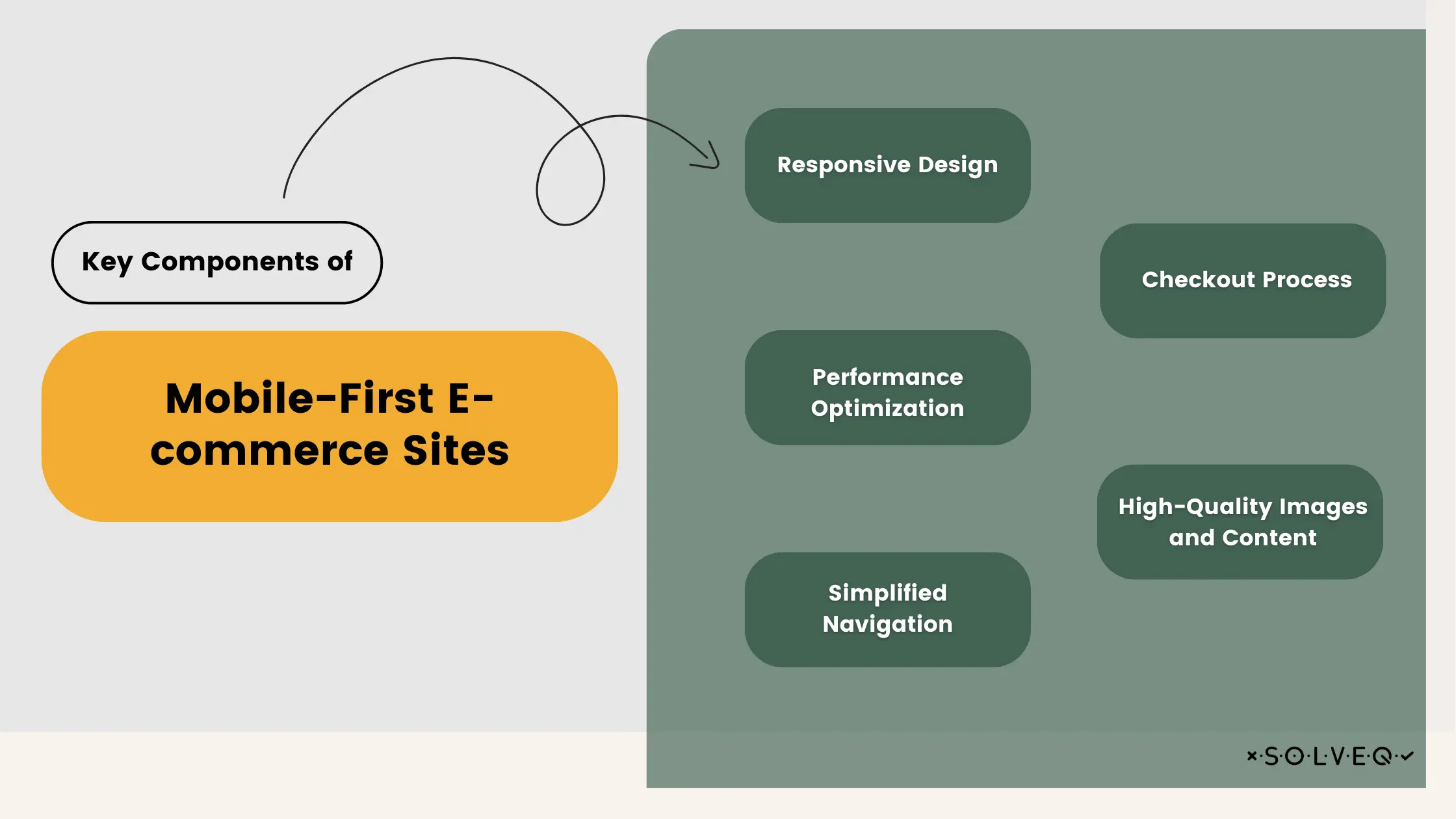
- Responsive Design: Essential for mobile-first sites, responsive design involves creating fluid layouts that adapt seamlessly to different screen sizes and orientations.
- Performance Optimization: This includes fast loading times and efficient resource usage, which are crucial for keeping mobile users engaged. Smooth animations and interactive elements should be optimized to maintain performance without draining mobile data or battery.
- Simplified Navigation: Mobile-first sites need easy-to-use, touch-friendly menus and interfaces to enhance user experience.
- Checkout Process: The checkout experience should be streamlined, secure, and optimized for mobile, minimizing the steps and hassle involved in completing a purchase.
- High-Quality Images and Content: These should be optimized for mobile platforms to ensure they load quickly and display correctly without compromising on quality or speed.
By focusing on these aspects, eCommerce businesses can ensure their sites are not only mobile-friendly but also poised for higher engagement, better search rankings, and expanded global reach.
Challenges of Mobile-First Development
Implementing a mobile-first strategy in eCommerce is not without its challenges. Each aspect of this approach requires careful consideration and balancing to ensure both functionality and performance are maintained.
Balancing Rich Features with Performance
One of the primary challenges is ensuring that the mobile version of an eCommerce site is both feature-rich and performs efficiently. Mobile devices, with their limited processing power and data constraints, necessitate a careful selection of features and design elements to ensure they do not impede site speed and responsiveness. This balance is crucial as it directly affects user engagement and conversion rates.
Cross-Device Compatibility and Testing
Ensuring that an eCommerce site works seamlessly across a myriad of devices, each with different screen sizes, operating systems, and browser capabilities, is another significant hurdle. Extensive testing is required to identify and fix compatibility issues, which can be both time-consuming and resource-intensive. This step is vital to provide a consistent user experience across all platforms.
Adapting Content and Design for Smaller Screens
Tailoring content and design to fit smaller screens, without losing functionality or aesthetic appeal, is a delicate task. This involves rethinking navigation structures, simplifying layouts, and resizing or reformatting content. The goal is to deliver all the necessary information and features of an eCommerce site in a way that is easily accessible and engaging on a mobile device. Overcoming this challenge is essential to maintain the effectiveness of the site and ensure that it meets the needs and expectations of mobile users.
These challenges underscore the complexity of adopting a mobile-first approach in eCommerce. However, overcoming them is critical for businesses to stay competitive in an increasingly mobile-centric market.
Best Practices for Mobile-First eCommerce Development
Embracing a mobile-first approach in eCommerce is not just about understanding its importance, but also about implementing it effectively. To navigate this landscape successfully, there are several best practices that businesses should adopt:
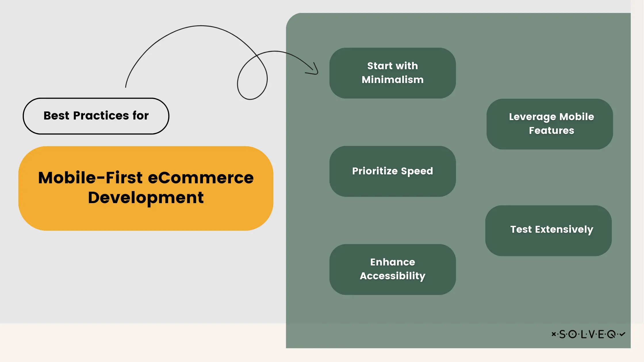
Start with Minimalism
In mobile-first development, beginning with a minimalist approach is key. Focus on the core features and content that are essential for your eCommerce platform. This strategy allows you to create a solid foundation that is optimized for mobile use. You can then gradually scale up and add more complex features or content as needed, ensuring that the site remains clean and uncluttered on smaller screens.
Prioritize Speed
Speed is critical in mobile-first development. Users on mobile devices often have less patience and slower internet connections. Optimize images and videos to reduce load times, choose mobile-friendly technologies, and minimize redirects. Implementing techniques like lazy loading, where content is loaded only when needed, can significantly improve site performance.
Enhance Accessibility
Accessibility should be a central consideration in your development process. A mobile-first eCommerce site must be usable by everyone, including people with disabilities. This involves designing for screen readers, ensuring adequate contrast ratios, and creating a navigation that is easy to use for people with various disabilities. Remember, making your site more accessible can broaden your customer base and enhance overall user satisfaction.
Leverage Mobile Features
Utilize the unique capabilities of mobile devices to enhance the user experience. This includes using geolocation to offer location-based services, integrating camera functionality for augmented reality experiences or barcode scanning, and utilizing push notifications to engage users with timely updates and offers. These features, when used thoughtfully, can significantly elevate the user experience and set your eCommerce platform apart from competitors.
Test Extensively
Thorough testing across a range of devices is crucial. This should include real devices as well as emulators to cover various operating systems, screen sizes, and browser types. Regular testing helps ensure that your site offers a consistent and smooth experience for all users, regardless of their device. Remember, what works well on one device might not translate effectively to another, so comprehensive testing is vital for a successful mobile-first strategy.
By adhering to these best practices, businesses can create a mobile-first eCommerce site that not only attracts users but also retains them through an efficient, accessible, and enjoyable shopping experience.

The Future of Mobile eCommerce
As we peer into the future of mobile eCommerce, several emerging technologies and trends stand poised to redefine the landscape:
- Augmented Reality (AR) and Virtual Reality (VR): These technologies are transforming the shopping experience by providing immersive and interactive ways for consumers to interact with products. AR and VR can offer virtual try-ons and in-depth product previews, enhancing the decision-making process for customers.
- Voice Commerce: The rise of voice-activated shopping aligns with the mobile user's need for convenience and speed. Shopping through voice commands is becoming more popular, offering a hands-free and seamless experience that fits perfectly into busy lifestyles.
- AI-Powered Personalization: Artificial Intelligence is revolutionizing the way eCommerce platforms cater to individual preferences. Through sophisticated AI algorithms, mobile eCommerce can provide personalized shopping experiences, product recommendations, and customer service, leading to higher engagement and customer loyalty.
Additionally, the role of mobile apps in complementing mobile websites cannot be understated:
- Mobile Apps: While mobile websites ensure broad accessibility and reach, mobile apps offer a deeper level of engagement. They provide enhanced functionality, better personalization, and smoother transaction processes. As a result, apps are becoming vital tools in building brand loyalty and encouraging repeat business.
Together, these advancements paint a picture of a dynamic, innovative future for mobile eCommerce, one that continuously evolves to meet the ever-changing demands and expectations of a mobile-centric consumer base.
Summary
Concluding, the mobile-first approach in eCommerce is more than a trend; it's a response to the evolving landscape where mobile shopping predominates. This article has highlighted the critical importance of user-friendly mobile UX, the implications of Google's mobile-first indexing for SEO, and the expansive reach that mobile commerce offers globally. We've also discussed the challenges of balancing feature-rich content with performance and adapting to various devices. Best practices like prioritizing speed, enhancing accessibility, and leveraging mobile-specific features have been emphasized as keys to success. Remember, adapting to a mobile-first world isn't just about staying relevant; it's about leading in a digital marketplace that is increasingly mobile. Take the first step today to ensure your business thrives in the evolving world of mobile eCommerce.
Share:
Looking for expert development team?
Schedule a call with Tech Consultant
Marcin Kulawik
Founder and CEO of SolveQ. Huge fan of building things with purpose, agility, and having fun while changing the World. Loves his family, teammates, and nature.